Discovering Colour
By Geoff Harris •
The successful use of colour in photography is a fundamental creative tool. By understanding the concepts of Colour Theory we can arm ourselves with the ability to make key decisions that will greatly influence the success of our images. My name is Phil Malpas, welcome to my first article on “Discovering Colour”. If you would like to learn more about this vital part of photography, why not join me on my 4 week online course Capturing Color with MyPhotoSchool. You get the opportunity to ask me direct questions and also have for photography critiqued by me so hope to see you soon.Bouncy Castle Princesse Maxi Multifun
In this article, we will look at the basic relationships between colours and how we can use this information to generate harmony, discord, contrast and drama in our images. We will discover how to maximise and minimise the impact of colour combinations and look at individual colours and how they might affect the viewer’s appreciation of our work inflatable slides.
Since its invention in the 1830s, there have been two major revolutions in photography. For more than half of its history, photographic visualisation was exclusively monochrome, exploiting form, texture and tone to create successful images. Contrast was managed through precise control of exposure and development to render a full range of tones in the photographic print. The colour of the subject matter was only of importance in relation to filtration which was used to alter the densities of various parts of the subject relative to one another.
Almost 100 years later everything changed as full colour photography became commercially viable for the first time. Contrast became the enemy, as in excess it led to reduced saturation and the failure to capture the full glory of colour. Photographers were able to put texture and tone to one side and simply use the colour of objects as their key compositional tool. This required a whole new understanding of colours and how they interact together.Aqua Run 01
More recently, the digital revolution has led to a deep analysis of the true meaning of colour and how to define specific tones, hues and degrees of saturation. Nothing is set in stone in modern photography. Individual tones can be enhanced, de-saturated, darkened or lightened for artistic effect. It has therefore become necessary for photographers to posses far greater technical knowledge about colour and its correct representation in their work.
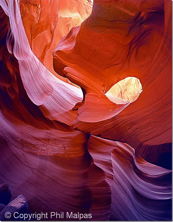
The prime objective of this article is to provide you with the tools and techniques to make better use of colour in your photography. Many of the concepts discussed might be viewed as second nature, but it is worth spending the time to analyse why some colour combinations achieve your desired effect and others do not. You should view this as the beginning of a wonderful relationship with colour. In the words of John Ruskin “The purest and most thoughtful minds are those that love colour the most”.
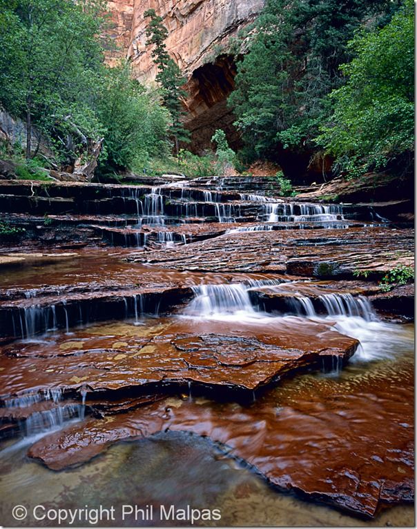
Throughout history, mankind has put forward theories as to how colours are created and what exactly happens when they are mixed together. The Ancient Greeks, for example, believed that colours depended on the amount of light present, simply because colours could not be seen in the dark! In 1704 Sir Issac Newton finally made some sense of things when he published his great work “Optiks”, in which he stated that colour was actually a property of light itself rather than a physical property of objects emitting colour.
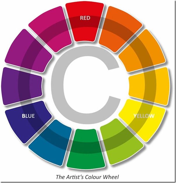
Newton proposed a model using his “Colour Circle” in which he wrapped the colours of the visible spectrum around so that the red end joined the blue end. Using this tool he was able to demonstrate how each colour in the circle is related to its neighbours. Over the centuries, Newton’s Colour Circle has been adapted and revised into a huge variety of “Colour Wheels”. The diagram shown here is called the “Artists Colour Wheel” as it demonstrates the relationship between different dyes, paints or pigments. This colour wheel is based upon the three fundamental or primary pigments, red, yellow and blue. This is probably the most common type of Colour Wheel you are likely to encounter, but from a photographic perspective we need to consider a different, if strikingly similar version.
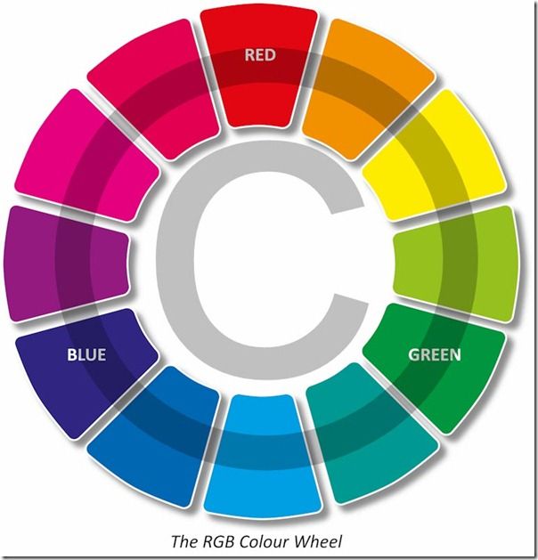
Rather than dealing with pigments or dyes, this colour wheel (known as the RGB Colour Wheel) relates to the relationships between colours of light (which is far more useful to us as photographers)! Each colour on the wheel is made by mixing light of the two adjacent colours. By analysing the positions of all the colours on this wheel we can learn a great deal about all colours and how they might interact. In order that we can discuss the RGB Colour Wheel in detail, we first need to establish a few definitions, give certain components of the wheel names and look at the actual meaning of each colour’s position on the wheel.
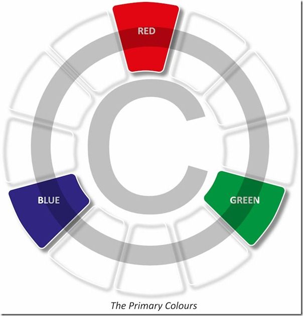
At this point it is worth making a note of the fundamental nature of Red, Green and Blue which can be thought of as the building blocks of all colours in the digital world. All the myriad of different colours we see in our photographs are created from a combination of just these three. Computer screens, televisions and, of course, cameras work in the same way when creating colour. Red Green and Blue are so important that they are given the name “Primary Colours”. You might also notice how they are equally spaced around the colour wheel, something I’ll return to later.
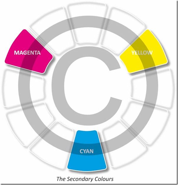
The next three colours to consider are positioned between each pair of primary colours. They are Cyan, Yellow and Magenta and perhaps unsurprisingly these are collectively known as “Secondary Colours”. Each Secondary colour is made by mixing the two primaries closest to it. For example Cyan is created by mixing Blue and Green. It is also worth noting that each Secondary Colour (like all colours on the wheel) does not contain any of the colour opposite. So yellow contains no blue and for this reason it is sometimes known as “Minus Blue”.
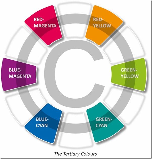
Finally we can take the remaining six colours which exist between the primary and secondary colours on the wheel. Again each of these is created by mixing the two colours adjacent to it, such that Orange for example, is a mixture of red and yellow. Collectively these six remaining colours are known as “Tertiary Colours”. Unlike Orange, they don’t all have common names so the convention is to name them using the colours they are created from in the form Primary-Secondary. So by this route Orange is actually named as “Red-Yellow” with the other five being “Green-Yellow”, “Green-Cyan”, “Blue-Cyan”, “Blue-Magenta” and “Red-Magenta”.
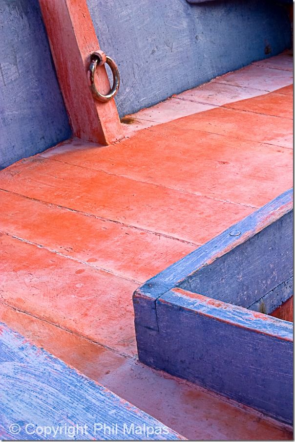
Of course there are more than just 12 colours in the real world. All of the colours we have been discussing so far are “pure” in that they contain no white or black. The term used to describe such pure colours is “Hue” which can be thought of as the dominant wavelength present. So Red, Blue, Cyan and Orange are examples of hues whereas pink and scarlet both have the hue red. In reality pure colours are rare and as can be seen in this image of a fishing boat in Sicily we are more likely to encounter colours that are mixed with varying degrees of white or black. So what we need is a model for describing all these non-pure colours as well…
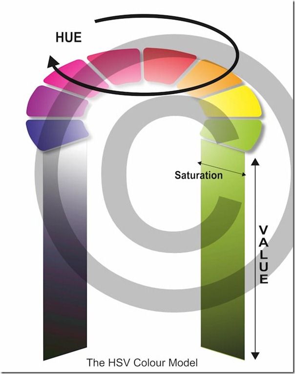
The best way to imagine the HSV Colour Model is to think of tipping the colour wheel on its side and then extending it downwards to create a three dimensional cylinder. The centre of the wheel at the top of the cylinder is white and the centre of the wheel at the bottom is black. So a vertical line down the centre of the cylinder would contain all possible tones of grey. As we progress outwards from the centre, each Hue is mixed with varying degrees of white or black depending on the height up the cylinder. The amount of white black or grey mixed with any Hue defines its “Saturation”. The lightness or darkness of any colour depends on the tone of grey mixed with it. This is known as its “Value”. Hence the HSV Colour Model (Hue, Saturation and Value) allows us to define any possible colour using just three terms.
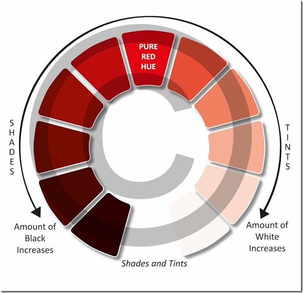
In order to fully understand the HSV Colour Model we need a couple more definitions. Colours that are mixed with white and made lighter are known as “Tints”, and colours that are mixed with Black and made darker are called “Shades”. These quantities can be precisely defined and such that every possible colour can be uniquely agreed upon by everyone.
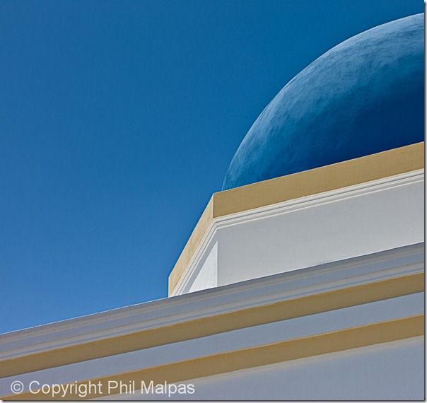
Now that we have accurately defined all the possible colours, it’s time we turned our attention to the relationships between them. The first relationship, which is one of the most important, is the one between any two colours which are opposite each other on the colour wheel. This image of one of the fabulous blue domes on the Mediterranean island of Santorini gives a clue as to what we are looking for.
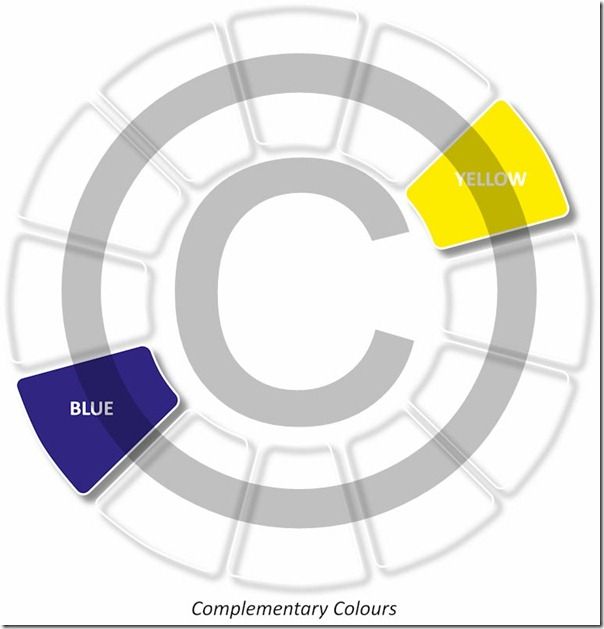
Any two colours which are directly opposite each other on the colour wheel are known as “Complementary Colours”. In the diagram shown here, the two I have selected are Blue and Yellow. Any photograph which includes just a pair of complementary colours will exhibit the maximum colour contrast possible and therefore have greater impact. This is true even if the two colours are evenly lit and effectively of the same tonality, so that in a black and white image they might appear identical. It doesn’t matter which two colours we pick as long as they are from the opposite sides of the colour wheel. The colour contrast we achieve will be greater if the colours in the subject are of pure Hue.
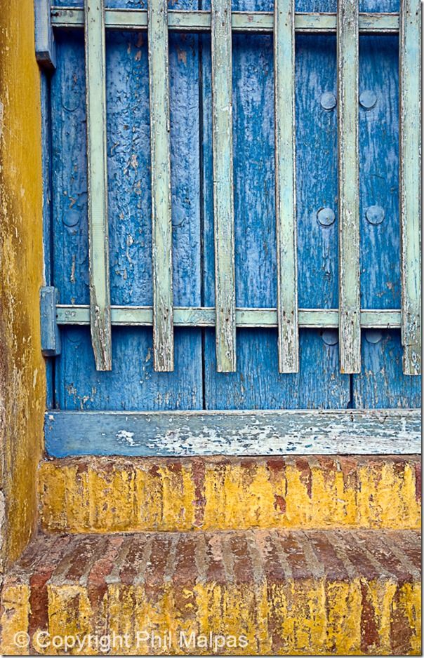
In this image of a doorway in Trinidad, Cuba, the complementary colours I selected were blue and yellow. In this case, however, they are tints (mixed with white) and not of pure hue. For this reason the impact I was hoping for is slightly diminished. Of course modern software allows us to artificially increase the saturation of colours in our images and provided we don’t go too far, it is possible to increase the colour contrast whilst making sure the image is still believable.
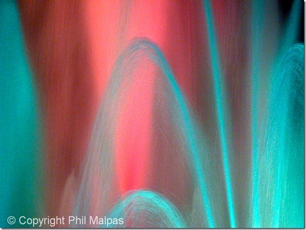
This picture was taken at the amazing “Font Magica” in Montjuic, Barcelona. The fountains are lit by hundreds of coloured lights and perform their intricate dance to music in front of tens of thousands of admiring spectators. I have to admit to being slightly fortunate to capture a moment when the water was lit by red and cyan complementary coloured lights.
For further reading see my Book Capturing Colour

Stay updated
Receive free updates by email including special offers and new courses.
